Colour
Contents
Our colour
Using colour
Our colour
The GES colour system is built around a strong core palette that defines our brand. We’ve extended it to allow for more expression, giving us the flexibility to stay recognisable while adapting to different channels, industries and moments.
Core Overview
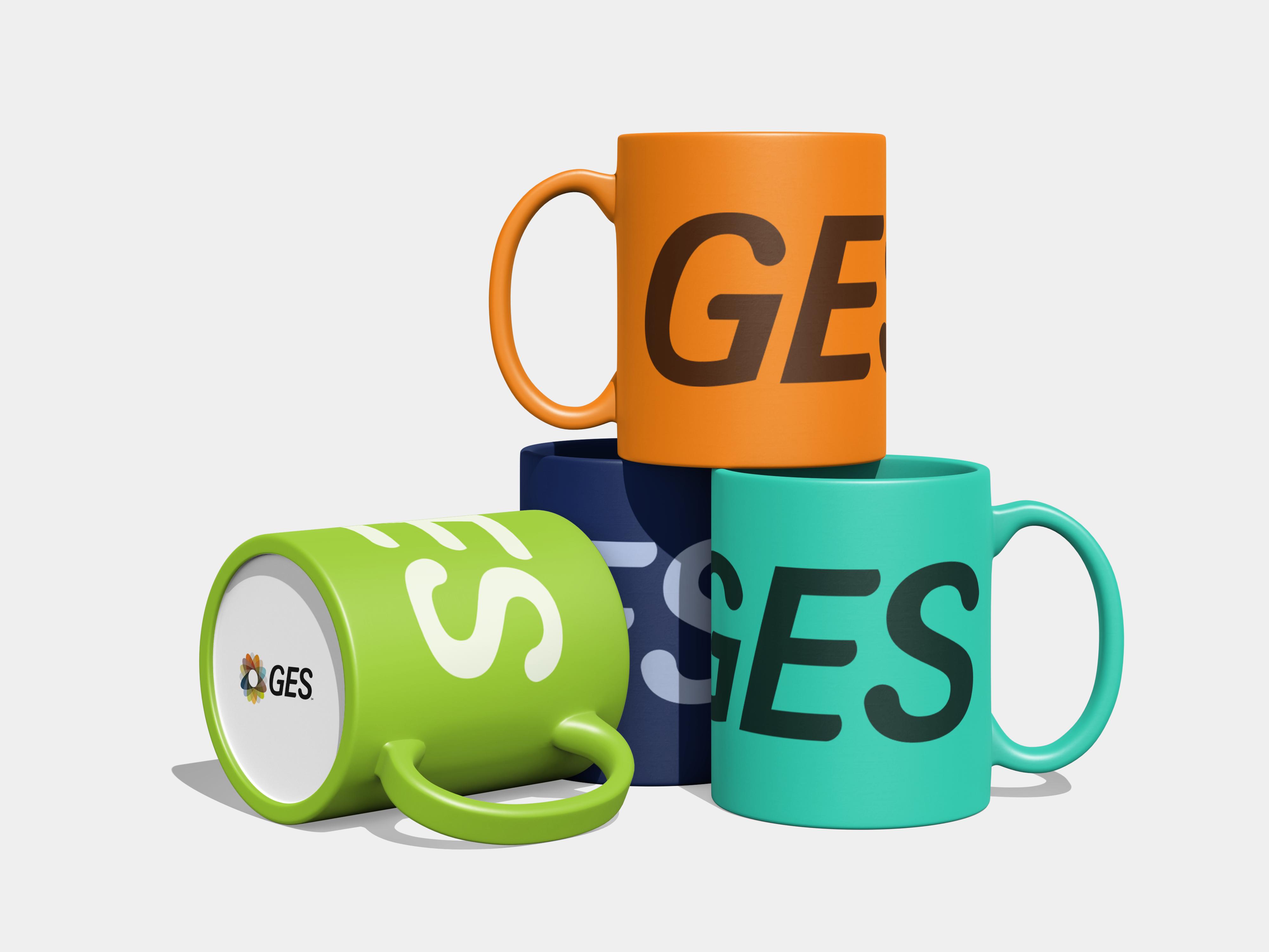
Our core primary colours, Navy (B700) and Lime Green (L500), are the backbone of the GES brand. Navy anchors the brand, while Lime adds energy and is the go-to for accents and calls to action.
B700
L500
Core primary
Our core primary colours, Navy (B700) and Lime Green (L500), are the backbone of the GES brand. Navy anchors the brand, while Lime adds energy and is the go-to for accents and calls to action.
T500
O500
Core secondary
Teal (T500) and Orange (O500) serve as our core secondary colours. They support the primaries and should be used sparingly to add depth and flexibility, without competing for attention.
Core
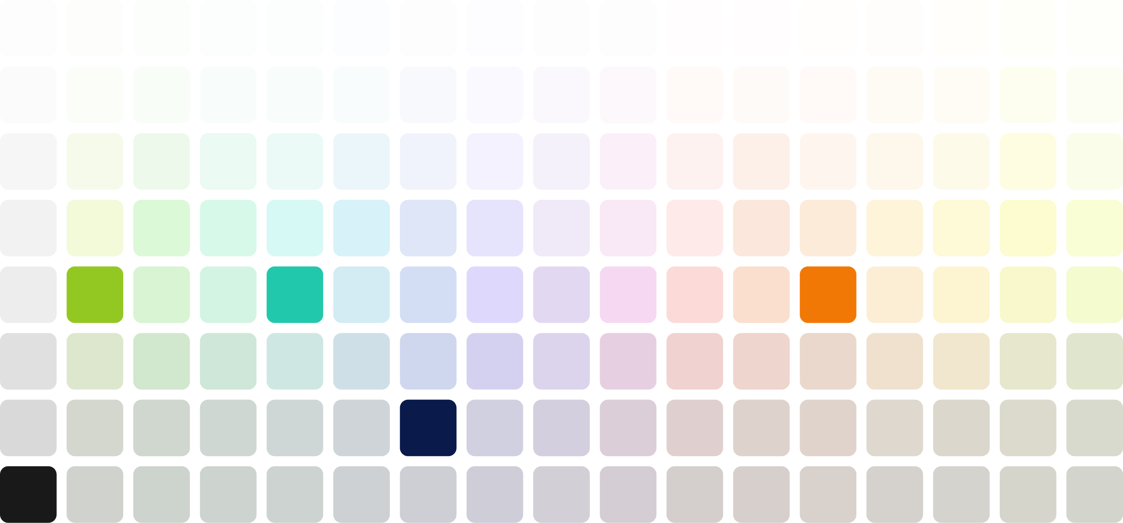
Uses only our core colours, the most limited and consistent set focused on recognisability and clarity.
Download spec sheet
Extended
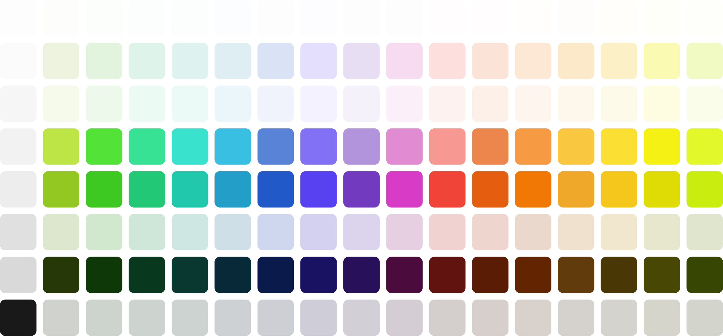
A more flexible set that adapts to different industries, campaigns, and partner brands, while still staying rooted in our system.
Download spec sheet
Complete
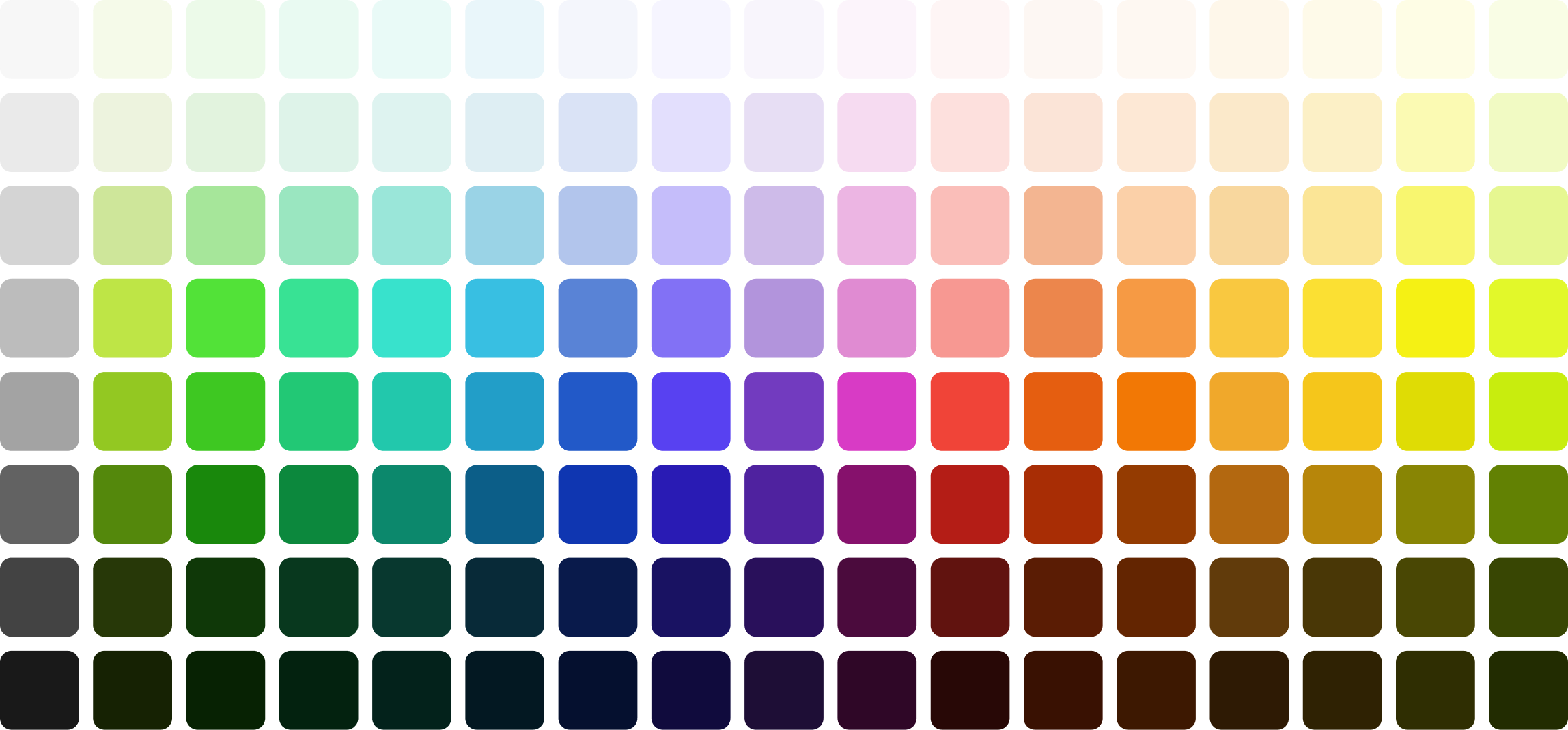
This is the full GES palette, our most expressive and versatile colour set. Designed for experienced designers, it offers maximum flexibility for creating impactful, layered work with energy and range. Use with intent, and always in support of the story you're telling.
Download spec sheet
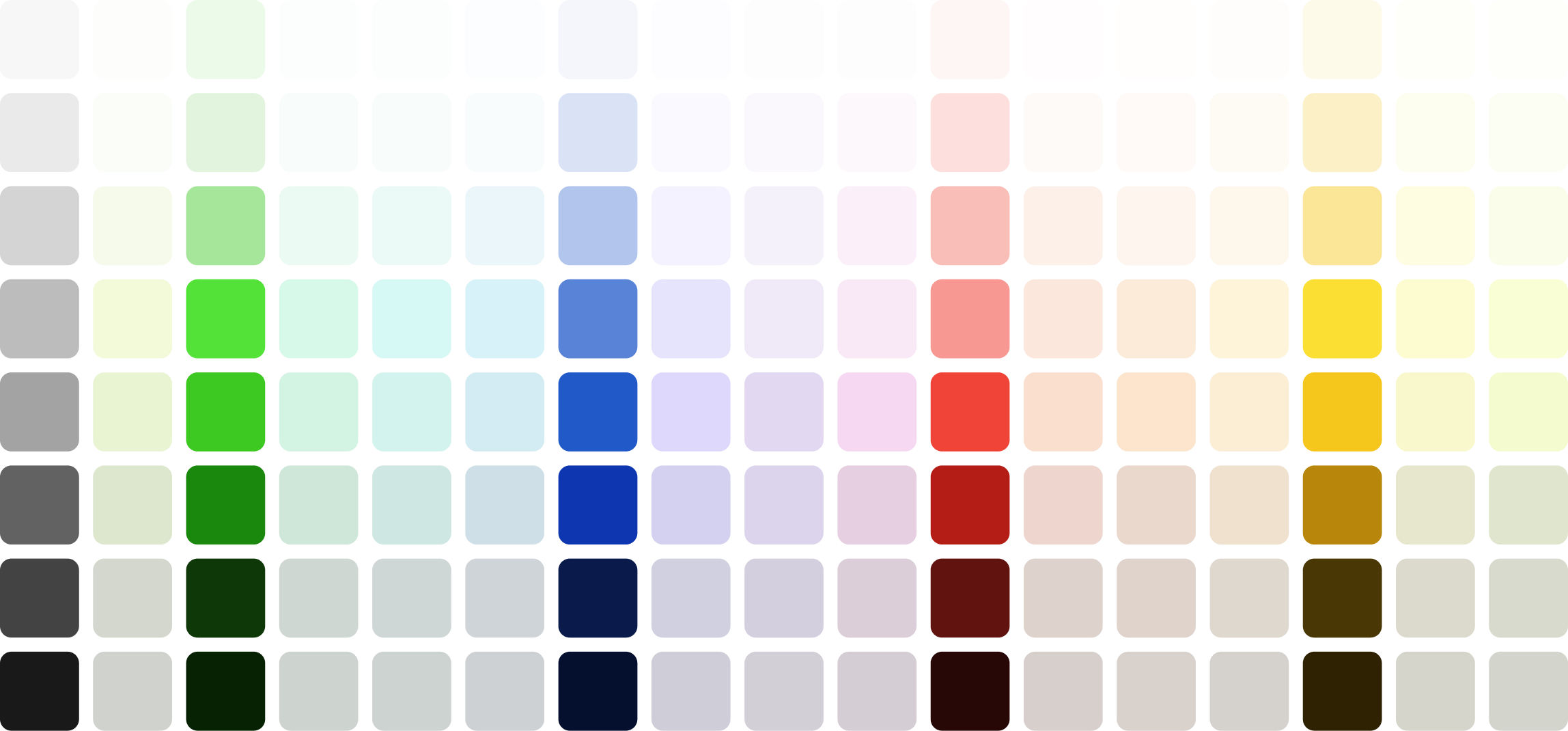
Product UI
These colours are reserved for GES product interfaces and digital tools. While not currently in use, they provide a consistent approach for common UI functions like success, error, warning, and information states.
This palette includes greyscale neutrals, along with red, green, blue, and yellow accents, designed to support accessibility, clarity, and future-ready consistency as GES products evolve.
Download spec sheet
Using colour
GES colours are split into Core and Extended.Core is your everyday go-to. Extended adds flexibility for more expressive moments.
Use what fits the context, and check with your local marketing team if you're unsure.
Overview
GES colours are split into Core and Extended.Core is your everyday go-to. Extended adds flexibility for more expressive moments.
Use what fits the context, and check with your local marketing team if you're unsure.

Core on light
Extended
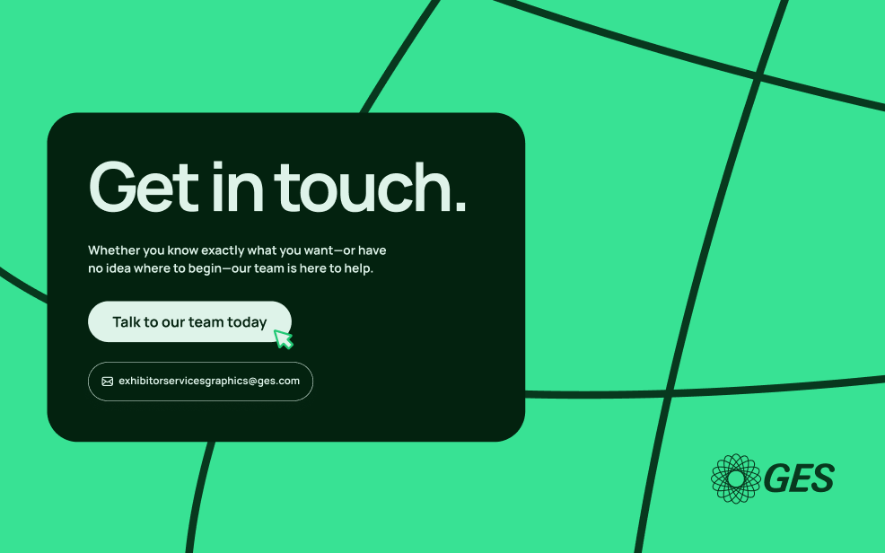
When in doubt always use Core colours, they’re simple, clean and consistent.
Tone-on-tone Colour pairing
Whenever we place text or buttons over colour, we must ensure they meet minimum accessibility contrast standards. Below is our interactive colour pairing tool for tone-on-tone combinations. Click a colour to see the correct pairings, contrast values, and colour codes.
Using these predefined pairs helps keep GES communications clear, accessible, and consistent with our brand standards.


For the magic of live moments.
Order now
Background
•
L400
Hex
#
BEE546
RGB
190
229
70
CMYK
34
0
82
0
Token
core.lime.400
Foreground
•
L700
Hex
#
273808
RGB
39
56
8
CMYK
77
53
93
63
Token
core.lime.700
Colour strategy
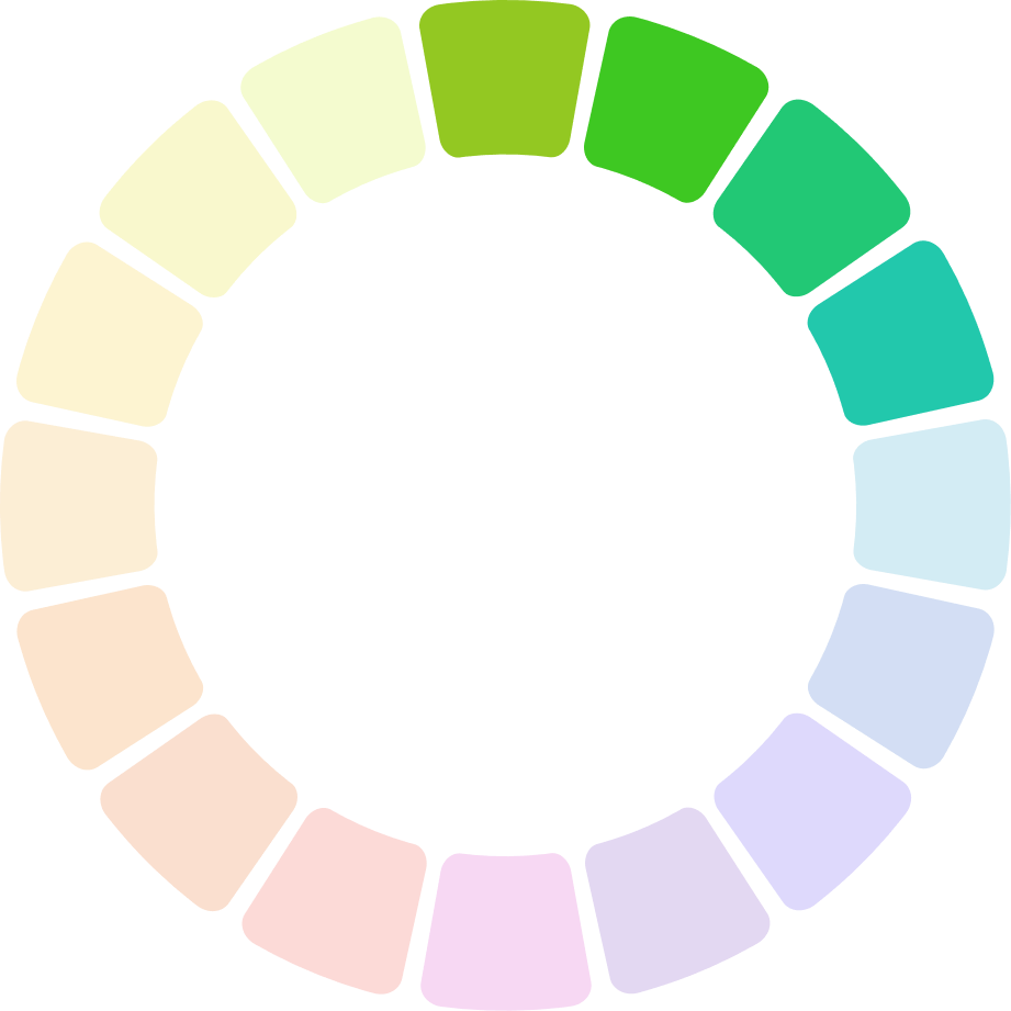
When tone-on-tone isn’t practical, especially when building more complex page structures, we recommend using the colour wheel for guidance.
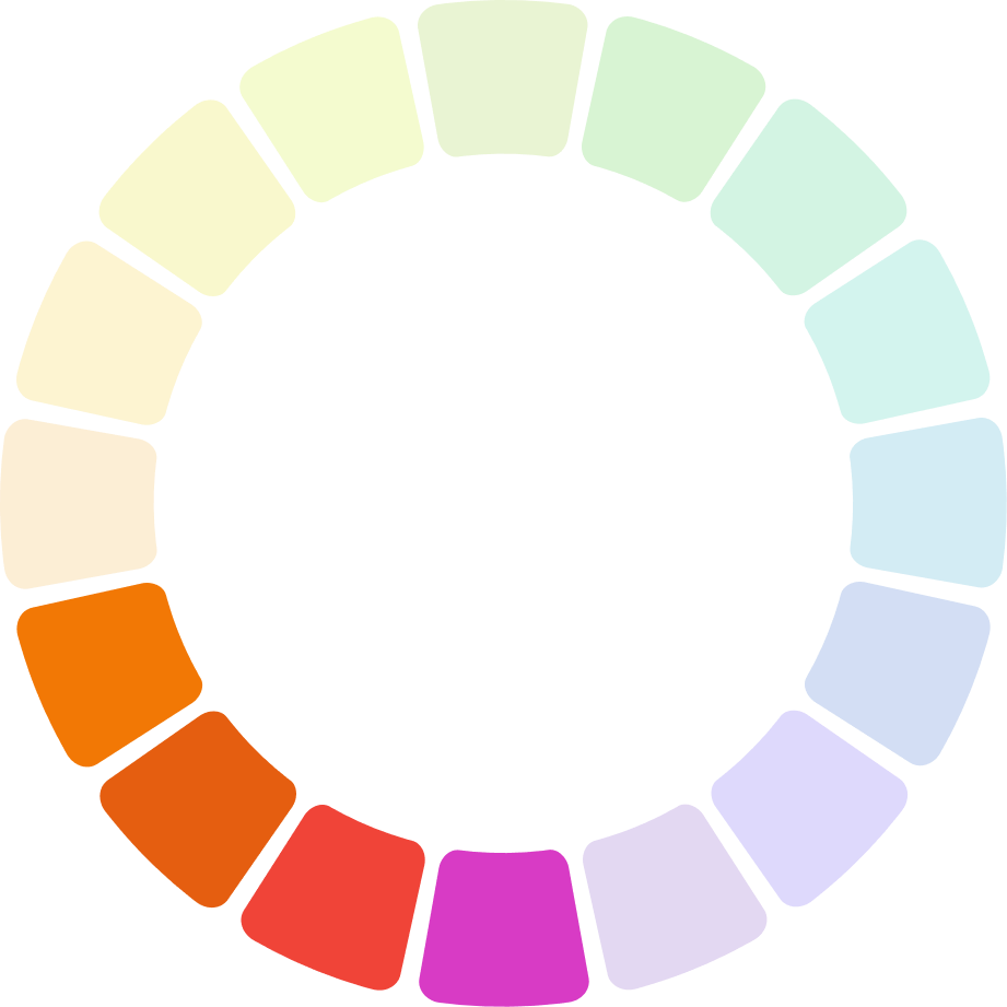
Analogous
Analogous colours sit side by side on the colour wheel, creating smooth, natural transitions. We've grouped them into four key ranges: greens, blues, reds, and yellows.
These sets offer a subtle, harmonious way to build structure, depth, and variation within a layout.
Greens

Blues
Reds

Yellows
When in doubt use one of these analogous colour groups.
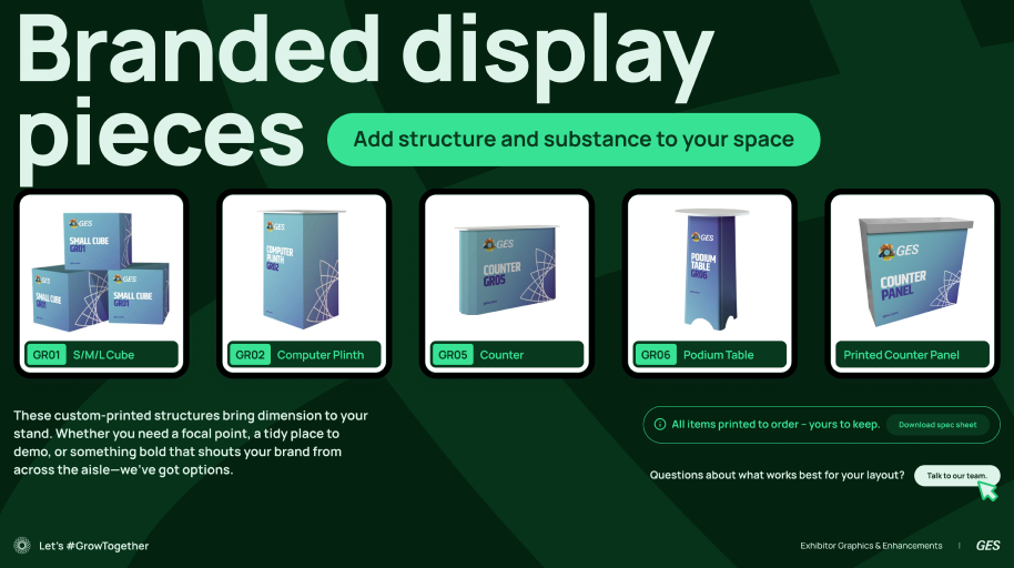
Analogous example


Complimentary
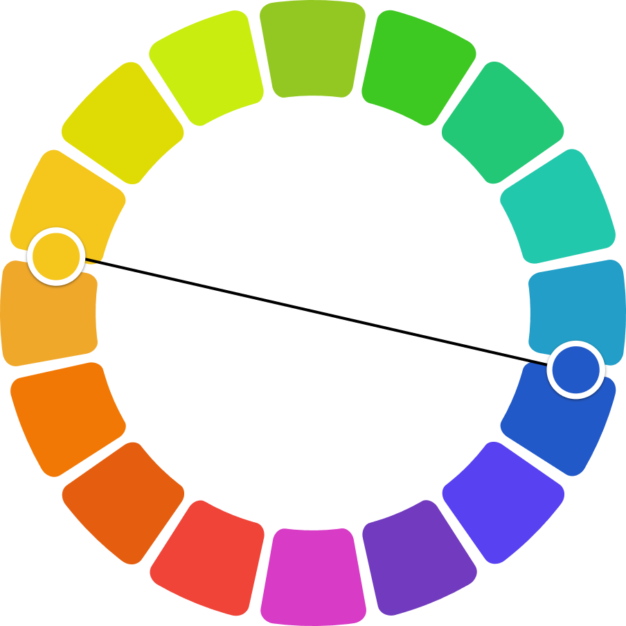
Complementary colours sit opposite each other on the colour wheel, creating bold, high-contrast combinations. While they can add real impact, they’re trickier to get right. Some pairings may clash, even if technically correct. Use with care, and always trust your eye over the theory.

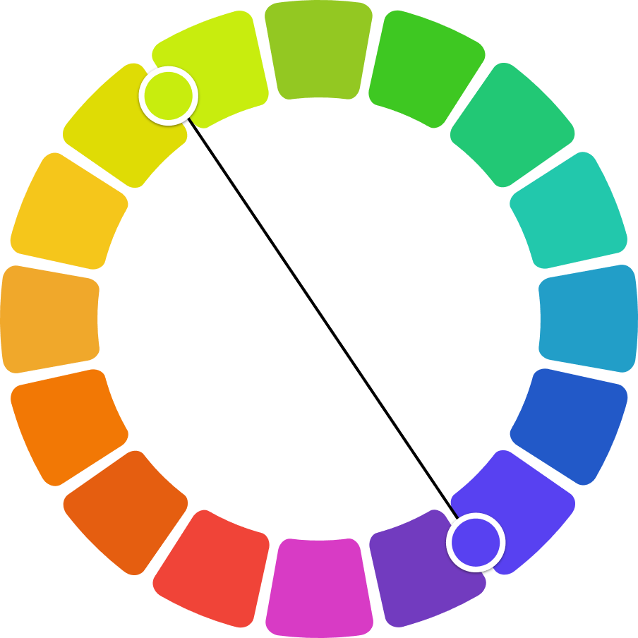

A selection of complimentary pairings that usually work well together.
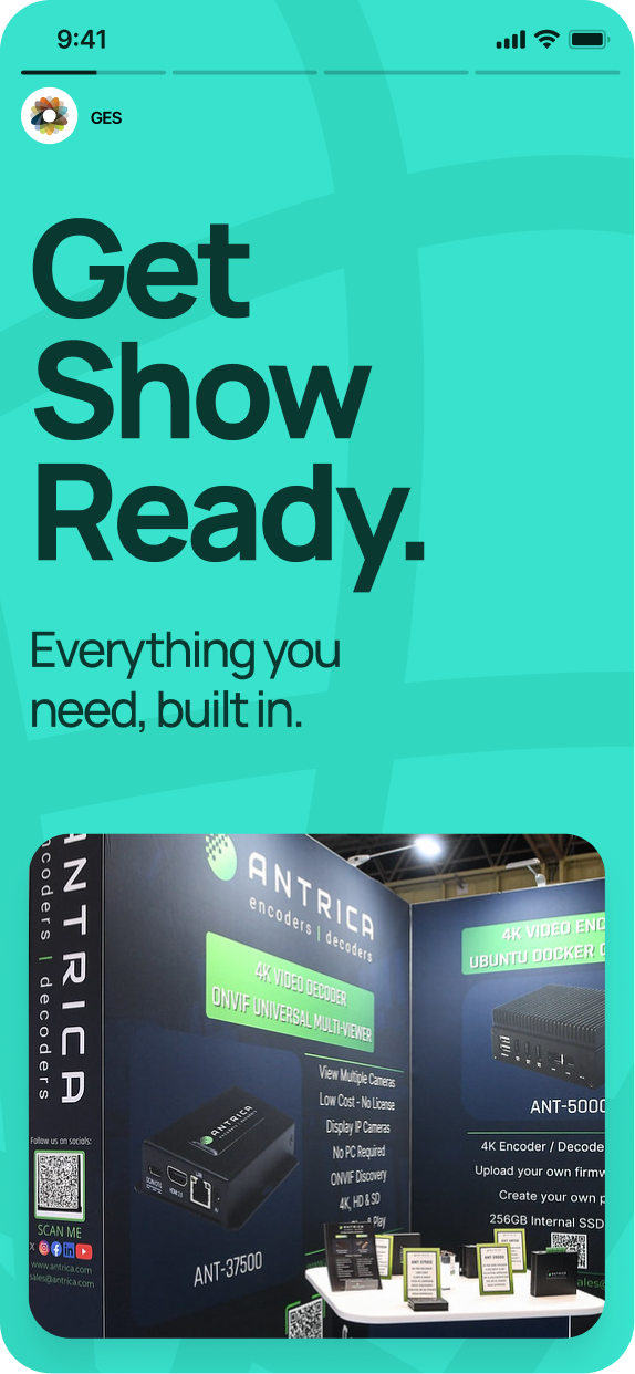
Analogous example
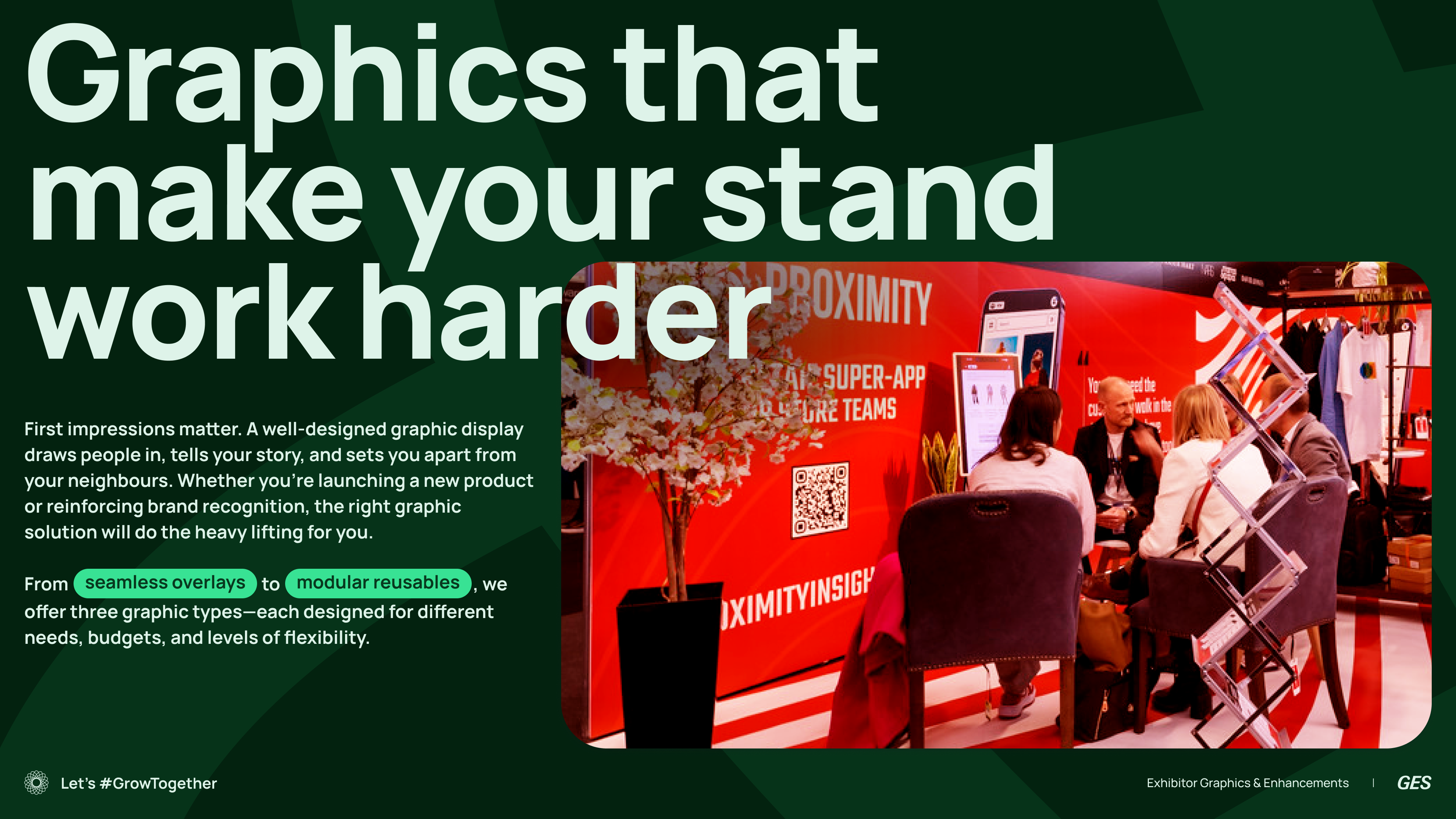
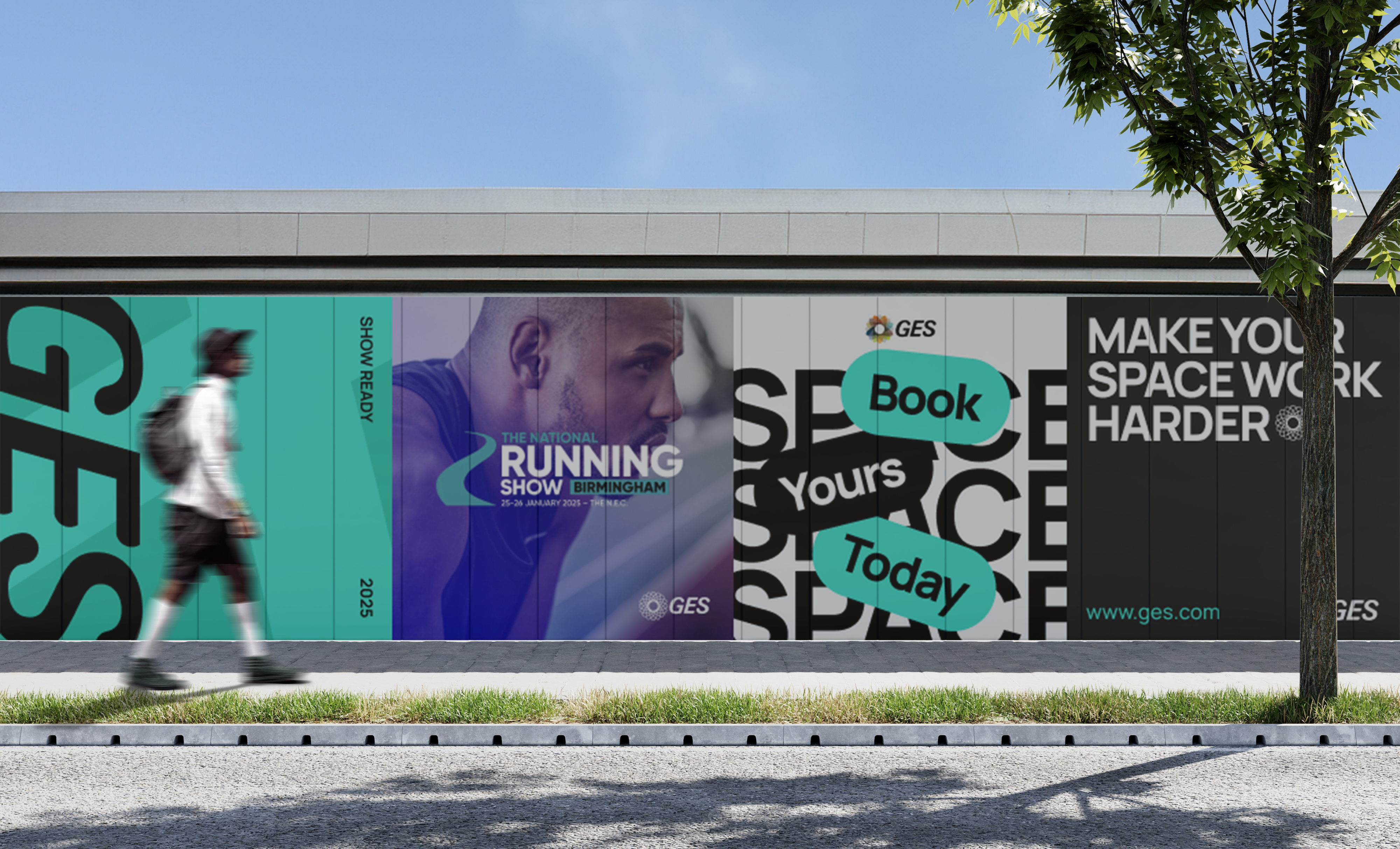
You have to also consider images that use a lot of solid colour.
Previous
Our logo
Next
Typography
© Gudstuff Design Ltd
All Rights Reserved
Colour
Contents
Our colour
Using colour
Our colour
The GES colour system is built around a strong core palette that defines our brand. We’ve extended it to allow for more expression, giving us the flexibility to stay recognisable while adapting to different channels, industries and moments.

Core Overview
Our core primary colours, Navy (B700) and Lime Green (L500), are the backbone of the GES brand. Navy anchors the brand, while Lime adds energy and is the go-to for accents and calls to action.
B700
L500
Core primary
Our core primary colours, Navy (B700) and Lime Green (L500), are the backbone of the GES brand. Navy anchors the brand, while Lime adds energy and is the go-to for accents and calls to action.
T500
O500
Core secondary
Teal (T500) and Orange (O500) serve as our core secondary colours. They support the primaries and should be used sparingly to add depth and flexibility, without competing for attention.
Core
Uses only our core colours, the most limited and consistent set focused on recognisability and clarity.

Download spec sheet
Extended
A more flexible set that adapts to different industries, campaigns, and partner brands, while still staying rooted in our system.

Download spec sheet
Complete
This is the full GES palette, our most expressive and versatile colour set. Designed for experienced designers, it offers maximum flexibility for creating impactful, layered work with energy and range. Use with intent, and always in support of the story you're telling.

Download spec sheet
Product UI
These colours are reserved for GES product interfaces and digital tools. While not currently in use, they provide a consistent approach for common UI functions like success, error, warning, and information states.
This palette includes greyscale neutrals, along with red, green, blue, and yellow accents, designed to support accessibility, clarity, and future-ready consistency as GES products evolve.

Download spec sheet
Using colour
GES colours are split into Core and Extended.Core is your everyday go-to. Extended adds flexibility for more expressive moments.
Use what fits the context, and check with your local marketing team if you're unsure.
Overview
GES colours are split into Core and Extended.Core is your everyday go-to. Extended adds flexibility for more expressive moments.
Use what fits the context, and check with your local marketing team if you're unsure.

Core on light

Extended
When in doubt always use Core colours, they’re simple, clean and consistent.

Tone-on-tone Colour pairing
Whenever we place text or buttons over colour, we must ensure they meet minimum accessibility contrast standards. Below is our interactive colour pairing tool for tone-on-tone combinations. Click a colour to see the correct pairings, contrast values, and colour codes.
Using these predefined pairs helps keep GES communications clear, accessible, and consistent with our brand standards.
Background
•
L400
Hex
#
BEE546
RGB
190
229
70
CMYK
34
0
82
0
Token
core.lime.400
Foreground
•
L700
Hex
#
273808
RGB
39
56
8
CMYK
77
53
93
63
Token
core.lime.700


For the magic of live moments.
Order now
Colour strategy
When tone-on-tone isn’t practical, especially when building more complex page structures, we recommend using the colour wheel for guidance.
Analogous
Analogous colours sit side by side on the colour wheel, creating smooth, natural transitions. We've grouped them into four key ranges: greens, blues, reds, and yellows.
These sets offer a subtle, harmonious way to build structure, depth, and variation within a layout.

Core

Blues

Reds

Yellows
When in doubt use one of these analogous colour groups.
Analogous example


Complimentary
Complementary colours sit opposite each other on the colour wheel, creating bold, high-contrast combinations. While they can add real impact, they’re trickier to get right. Some pairings may clash, even if technically correct. Use with care, and always trust your eye over the theory.


A selection of complimentary pairings that usually work well together.
Analogous example

You have to also consider images that use a lot of solid colour.
Previous
Our logo
Next
Typography
© Gudstuff Design Ltd
All Rights Reserved
Colour
Contents
Our colour
Using colour
Our colour
The GES colour system is built around a strong core palette that defines our brand. We’ve extended it to allow for more expression, giving us the flexibility to stay recognisable while adapting to different channels, industries and moments.

Brand Palette
Our core primary colours, Navy (B700) and Lime Green (L500), are the backbone of the GES brand. Navy anchors the brand, while Lime adds energy and is the go-to for accents and calls to action.
B700
L500
Core primary
Our core primary colours, Navy (B700) and Lime Green (L500), are the backbone of the GES brand. Navy anchors the brand, while Lime adds energy and is the go-to for accents and calls to action.
T500
O500
Core secondary
Teal (T500) and Orange (O500) serve as our core secondary colours. They support the primaries and should be used sparingly to add depth and flexibility, without competing for attention.
Core
Uses only our core colours, the most limited and consistent set focused on recognisability and clarity.

Download spec sheet
Extended
A more flexible set that adapts to different industries, campaigns, and partner brands, while still staying rooted in our system.

Download spec sheet
Complete
This is the full GES palette, our most expressive and versatile colour set. Designed for experienced designers, it offers maximum flexibility for creating impactful, layered work with energy and range. Use with intent, and always in support of the story you're telling.

Download spec sheet
Product UI
These colours are reserved for GES product interfaces and digital tools. While not currently in use, they provide a consistent approach for common UI functions like success, error, warning, and information states.
This palette includes greyscale neutrals, along with red, green, blue, and yellow accents, designed to support accessibility, clarity, and future-ready consistency as GES products evolve.

Download spec sheet
Using colour
GES colours are split into Core and Extended.Core is your everyday go-to. Extended adds flexibility for more expressive moments.
Use what fits the context, and check with your local marketing team if you're unsure.
Overview
GES colours are split into Core and Extended.Core is your everyday go-to. Extended adds flexibility for more expressive moments.
Use what fits the context, and check with your local marketing team if you're unsure.

Core

Extended
When in doubt always use Core colours, they’re simple, clean and consistent.

Tone-on-tone Colour pairing
Whenever we place text or buttons over colour, we must ensure they meet minimum accessibility contrast standards. Below is our interactive colour pairing tool for tone-on-tone combinations. Click a colour to see the correct pairings, contrast values, and colour codes.
Using these predefined pairs helps keep GES communications clear, accessible, and consistent with our brand standards.
Background
•
L400
Hex
#
BEE546
RGB
190
229
70
CMYK
34
0
82
0
Token
core.lime.400
Foreground
•
L700
Hex
#
273808
RGB
39
56
8
CMYK
77
53
93
63
Token
core.lime.700


For the magic of live moments.
Order now
Colour strategy
When tone-on-tone isn’t practical, especially when building more complex page structures, we recommend using the colour wheel for guidance.
Analogous
Analogous colours sit side by side on the colour wheel, creating smooth, natural transitions. We've grouped them into four key ranges: greens, blues, reds, and yellows.
These sets offer a subtle, harmonious way to build structure, depth, and variation within a layout.

Greens

Blues

Reds

Yellows
When in doubt use one of these analogous colour groups.
Analogous example


Complimentary
Complementary colours sit opposite each other on the colour wheel, creating bold, high-contrast combinations. While they can add real impact, they’re trickier to get right. Some pairings may clash, even if technically correct. Use with care, and always trust your eye over the theory.


A selection of complimentary pairings that usually work well together.
Complimentary example

You have to also consider images that use a lot of solid colour.
Previous
Our logo
Next
Typography
© Gudstuff Design Ltd
All Rights Reserved