Typography
Contents
Our typeface
Using type
Our typeface
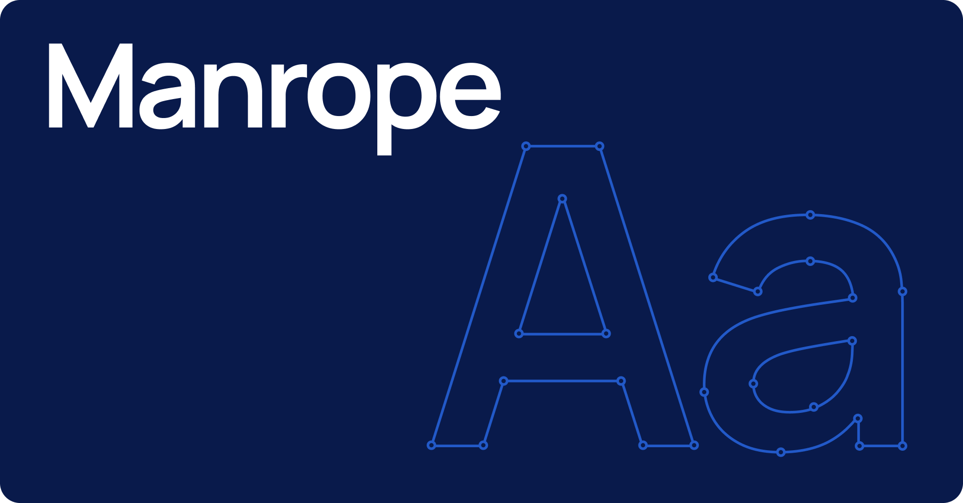
Manrope is our core typeface. It’s modern, approachable, and gives GES a clear, professional tone across all brand communications.
For longer text or digital use, we pair it with Inter — a highly legible typeface designed for readability at all sizes. Together, they keep our typography consistent, flexible, and easy to work with.
Using type
Typography plays a key role in how the GES brand is seen and understood. This section covers how to use our typefaces clearly and consistently, from applying hierarchy and colour contrast to choosing the right fallback when brand fonts aren’t available.
Hierarchy
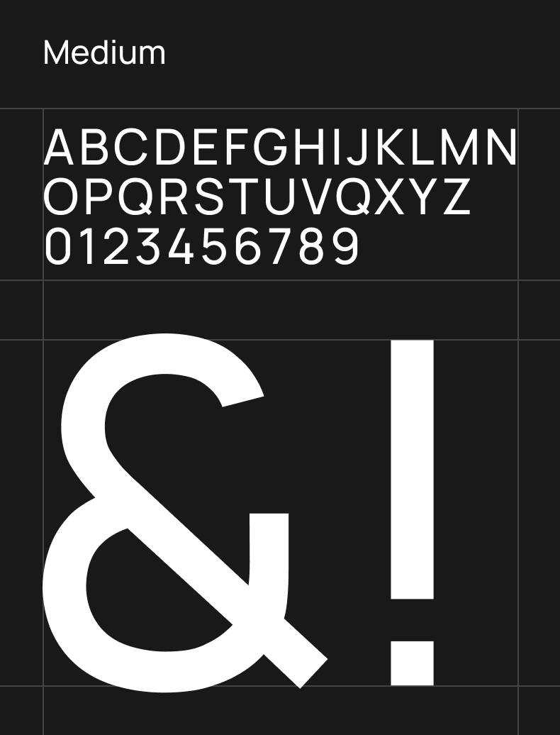
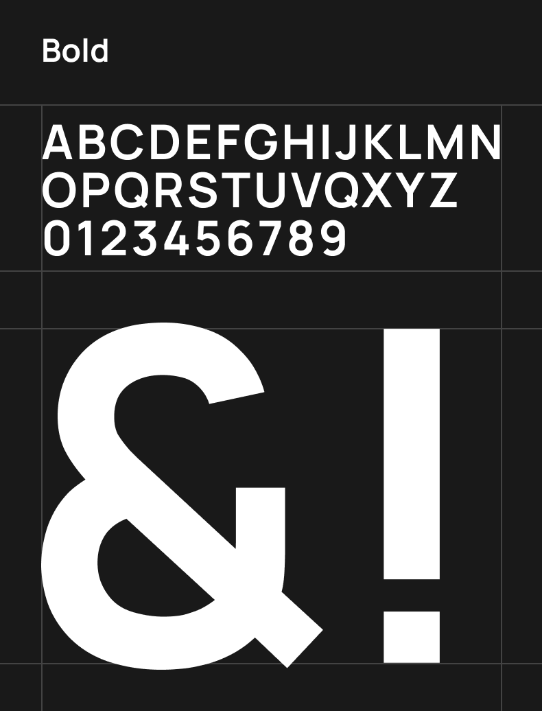
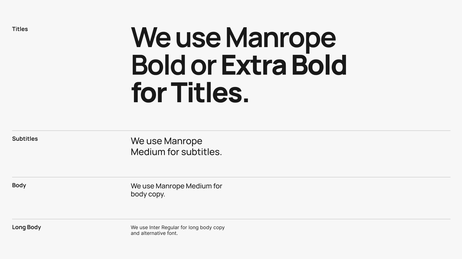
We use Manrope Medium as our default weight for most text. For headings, use Manrope Bold or Extra Bold to add structure and emphasis.
For longer body text, especially in digital formats, Inter Regular is preferred for improved legibility and reading comfort. Use consistently to create clear, accessible hierarchy across all applications.
Download fonts
Type on colour
Always aim for maximum contrast when placing text on coloured backgrounds. For core colours, use white or black, whichever provides the highest legibility and meets accessibility standards.
When working with the extended palette, follow the same rules as the tone-on-tone colour pairing guidance. Choose the darkest or lightest shade of the same colour family to maintain contrast while staying visually consistent.
If in doubt, use the Colour Pairing Tool or refer to examples in the Expression section.



Fallback font
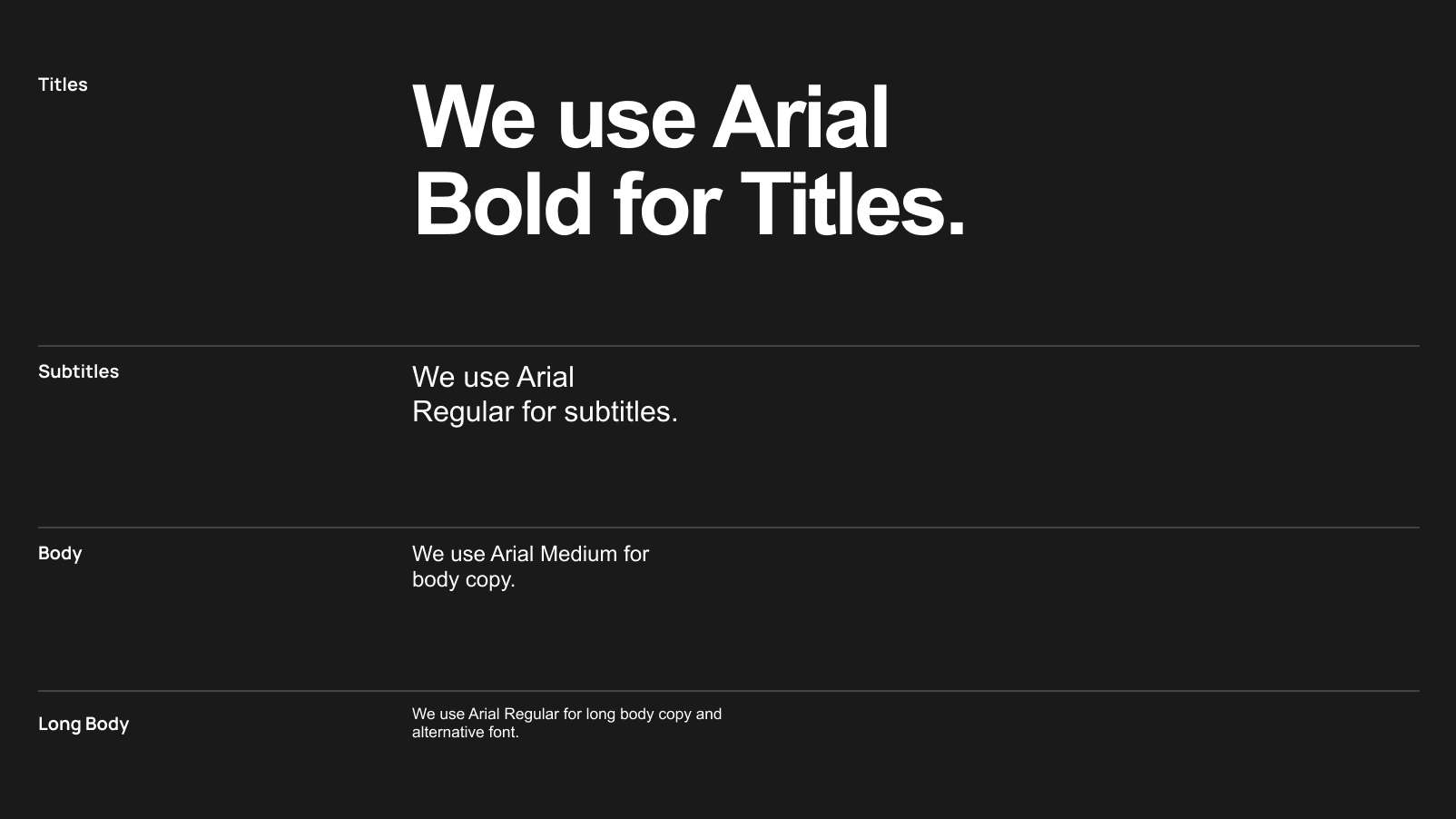
If Manrope and Inter aren’t available in the tool you’re using, use Arial Regular for body text and Arial Bold for headings. This fallback is only for cases where our brand fonts can’t be applied, usually in quick-turn sales documents or platforms with font limitations. For anything public facing, always go through the marketing team to ensure brand consistency.
Arial is a backup, not a replacement.
Previous
Overview
Next
Showcase
© Gudstuff Design Ltd
All Rights Reserved
Typography

Contents
Our typeface
Using type
Our typeface
Manrope is our core typeface. It’s modern, approachable, and gives GES a clear, professional tone across all brand communications.
For longer text or digital use, we pair it with Inter — a highly legible typeface designed for readability at all sizes. Together, they keep our typography consistent, flexible, and easy to work with.


Using type
Typography plays a key role in how the GES brand is seen and understood. This section covers how to use our typefaces clearly and consistently, from applying hierarchy and colour contrast to choosing the right fallback when brand fonts aren’t available.
Hierarchy
We use Manrope Medium as our default weight for most text. For headings, use Manrope Bold or Extra Bold to add structure and emphasis.
For longer body text, especially in digital formats, Inter Regular is preferred for improved legibility and reading comfort. Use consistently to create clear, accessible hierarchy across all applications.
Download fonts

Type on colour
Always aim for maximum contrast when placing text on coloured backgrounds. For core colours, use white or black, whichever provides the highest legibility and meets accessibility standards.
When working with the extended palette, follow the same rules as the tone-on-tone colour pairing guidance. Choose the darkest or lightest shade of the same colour family to maintain contrast while staying visually consistent.
If in doubt, use the Colour Pairing Tool or refer to examples in the Expression section.


Fallback font
If Manrope and Inter aren’t available in the tool you’re using, use Arial Regular for body text and Arial Bold for headings. This fallback is only for cases where our brand fonts can’t be applied, usually in quick-turn sales documents or platforms with font limitations. For anything public facing, always go through the marketing team to ensure brand consistency.
Arial is a backup, not a replacement.

Previous
Colours
Next
Showcase
© Gudstuff Design Ltd
All Rights Reserved
Typography

Contents
Our typeface
Using type
Our typeface
Manrope is our core typeface. It’s modern, approachable, and gives GES a clear, professional tone across all brand communications.
For longer text or digital use, we pair it with Inter — a highly legible typeface designed for readability at all sizes. Together, they keep our typography consistent, flexible, and easy to work with.


Using type
Typography plays a key role in how the GES brand is seen and understood. This section covers how to use our typefaces clearly and consistently, from applying hierarchy and colour contrast to choosing the right fallback when brand fonts aren’t available.
Hierarchy
We use Manrope Medium as our default weight for most text. For headings, use Manrope Bold or Extra Bold to add structure and emphasis.
For longer body text, especially in digital formats, Inter Regular is preferred for improved legibility and reading comfort. Use consistently to create clear, accessible hierarchy across all applications.
Download fonts

Type on colour
Always aim for maximum contrast when placing text on coloured backgrounds. For core colours, use white or black, whichever provides the highest legibility and meets accessibility standards.
When working with the extended palette, follow the same rules as the tone-on-tone colour pairing guidance. Choose the darkest or lightest shade of the same colour family to maintain contrast while staying visually consistent.
If in doubt, use the Colour Pairing Tool or refer to examples in the Expression section.


Fallback font
If Manrope and Inter aren’t available in the tool you’re using, use Arial Regular for body text and Arial Bold for headings. This fallback is only for cases where our brand fonts can’t be applied, usually in quick-turn sales documents or platforms with font limitations. For anything public facing, always go through the marketing team to ensure brand consistency.
Arial is a backup, not a replacement.

Previous
Colours
Next
Expression
© Gudstuff Design Ltd
All Rights Reserved