Our logo
Contents
Using our logo
Our logo specs
Using our logo
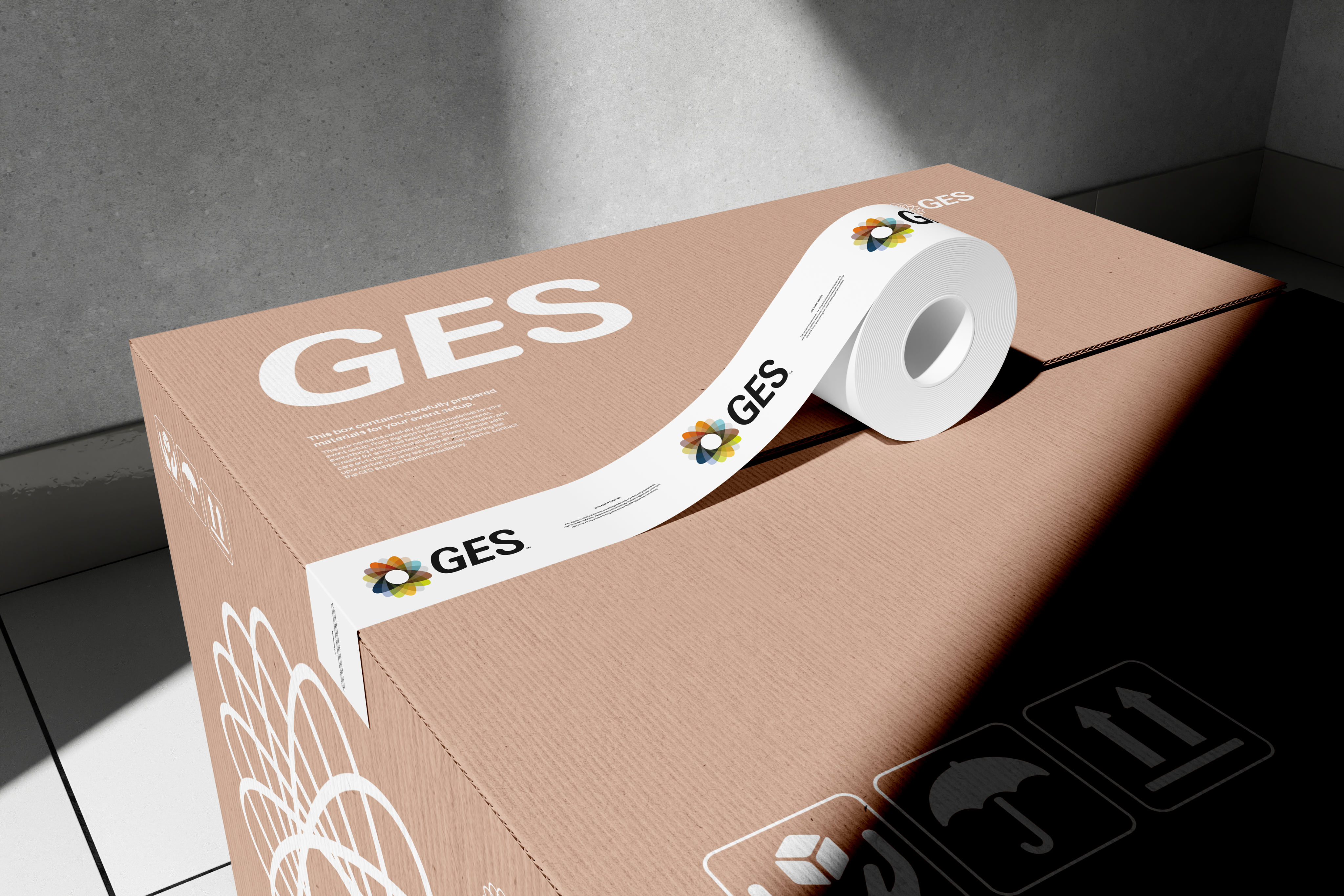
The GES logo is a key part of our identity, and how we use it matters. From the full lockup to the standalone spirograph, each version has a role to play depending on the context.
This section outlines when to use the core logo, when to lean on more flexible formats, and how to maintain clarity and consistency across every application, from event signage to social icons.
Core
The full-colour spirograph works best on light backgrounds—this keeps the colours vibrant and clear.
On darker backgrounds, the full-colour version can be harder to get right. In those cases, consider using the mono mark for better contrast and clarity.
Core on light
Core on dark
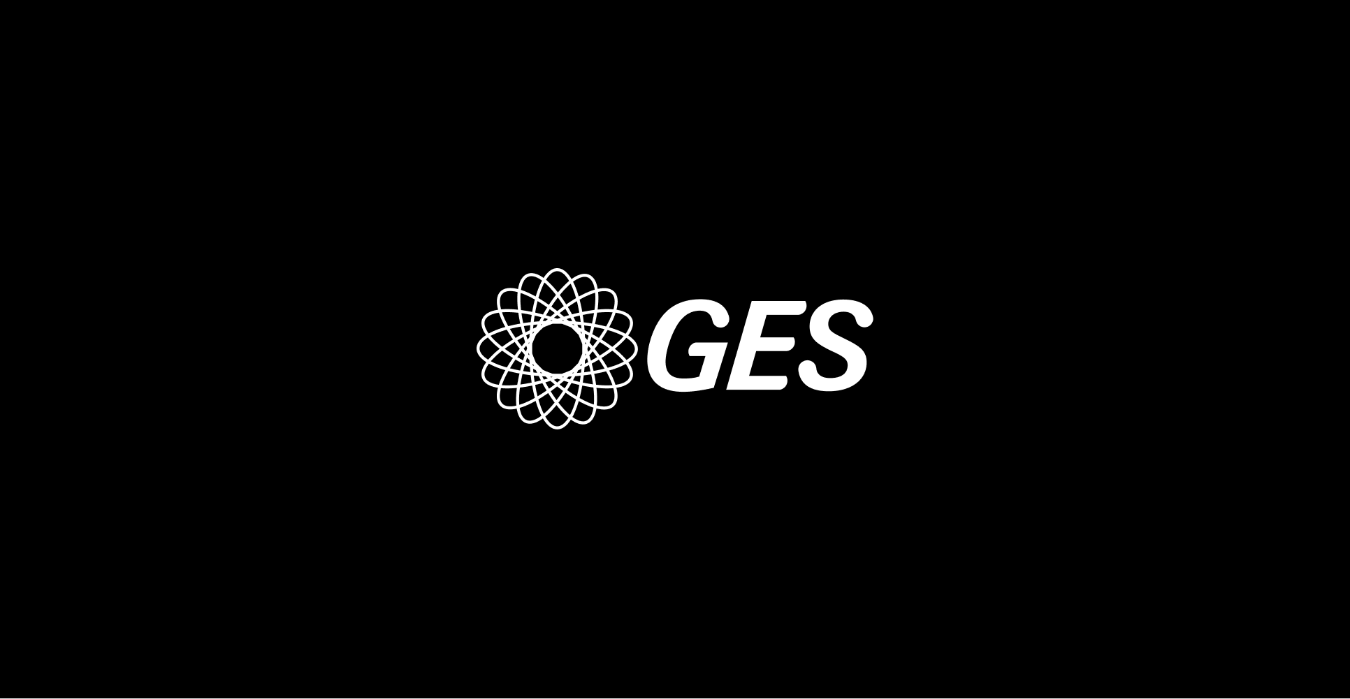
The mono white is our preferred logo variation on dark backgrounds due to its high contrast.
Black and white
Use the black logo on light backgrounds, and the white logo on dark or photographic ones, whichever gives you the best contrast and legibility.
When in doubt, test the combination or refer to the Colour Pairing Tool for guidance.
Mono black
Mono white

Tone on tone
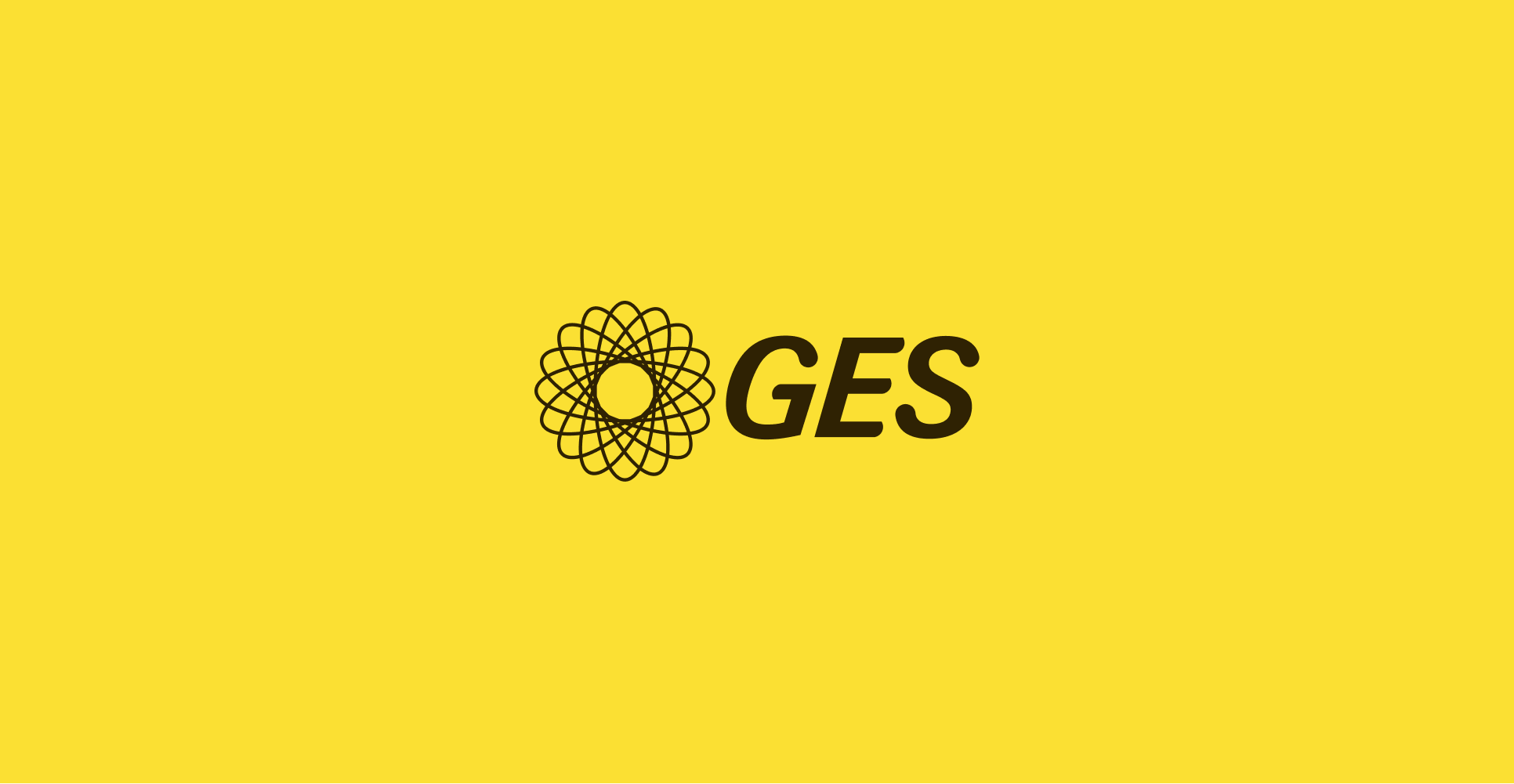
If the background is a light colour, use the darkest shade of that colour for the logo. It helps maintain contrast while staying visually consistent.
See the Logo Showcase for examples.


Our logo specs
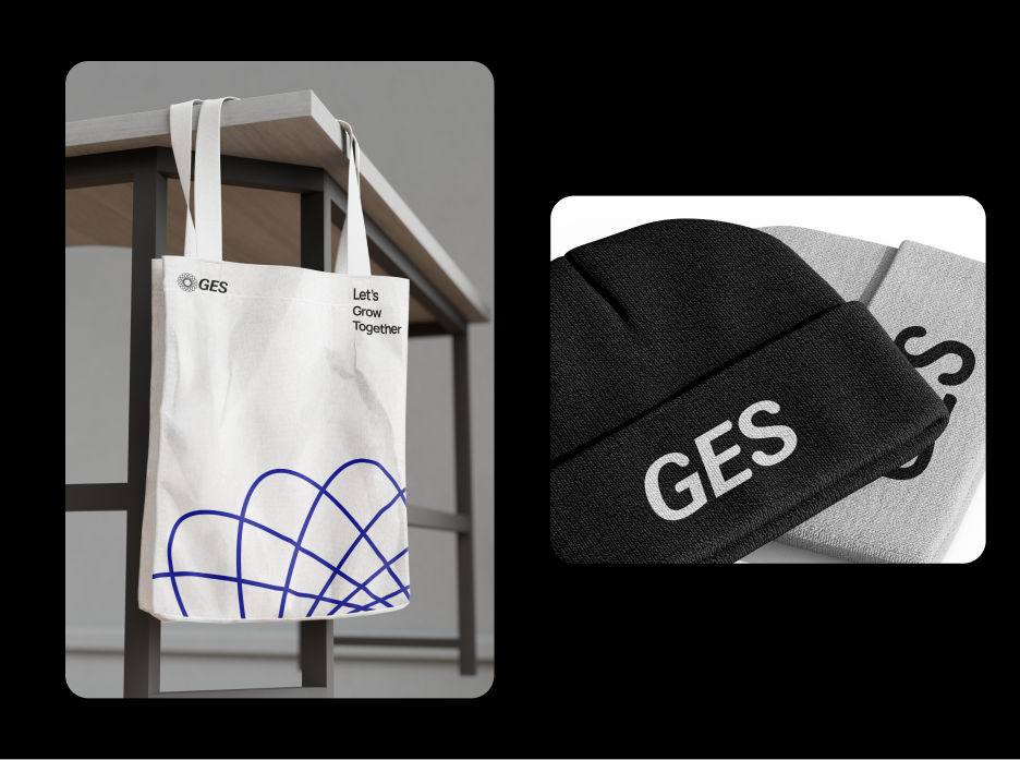
The GES logo is a key part of our identity. To keep it clear and consistent, always follow the basic specs: spacing, sizing, placement and colour usage.
This section gives you the practical guidance you need to apply the logo correctly across all formats, from print and signage to digital and motion. It's not about decoration, it's about maintaining clarity, impact and recognisability wherever our logo appears.

Identity
The GES logo is a familiar, recognisable mark. Its lasting form reflects our heritage, while the dynamic colour range speaks to the diversity of our work, our community, and the experiences we help create.

Primary

Secondary
Elements
Our logo is built from three core components. Each can be used flexibly depending on the space, context, or technical requirements — but together, they form the foundation of the GES brand.

Full logo lockup
The default and most recognisable expression of our brand, with the logomark on the left and wordmark on the right. This is the preferred version and should be used wherever space and format allow.
This is commonly known as the ‘logo’.

Logomark
The spirograph symbol, our most distinctive visual asset. It’s used on its own when space is tight or where a bold, visual presence is needed (like social icons or graphic treatments).
Wordmark
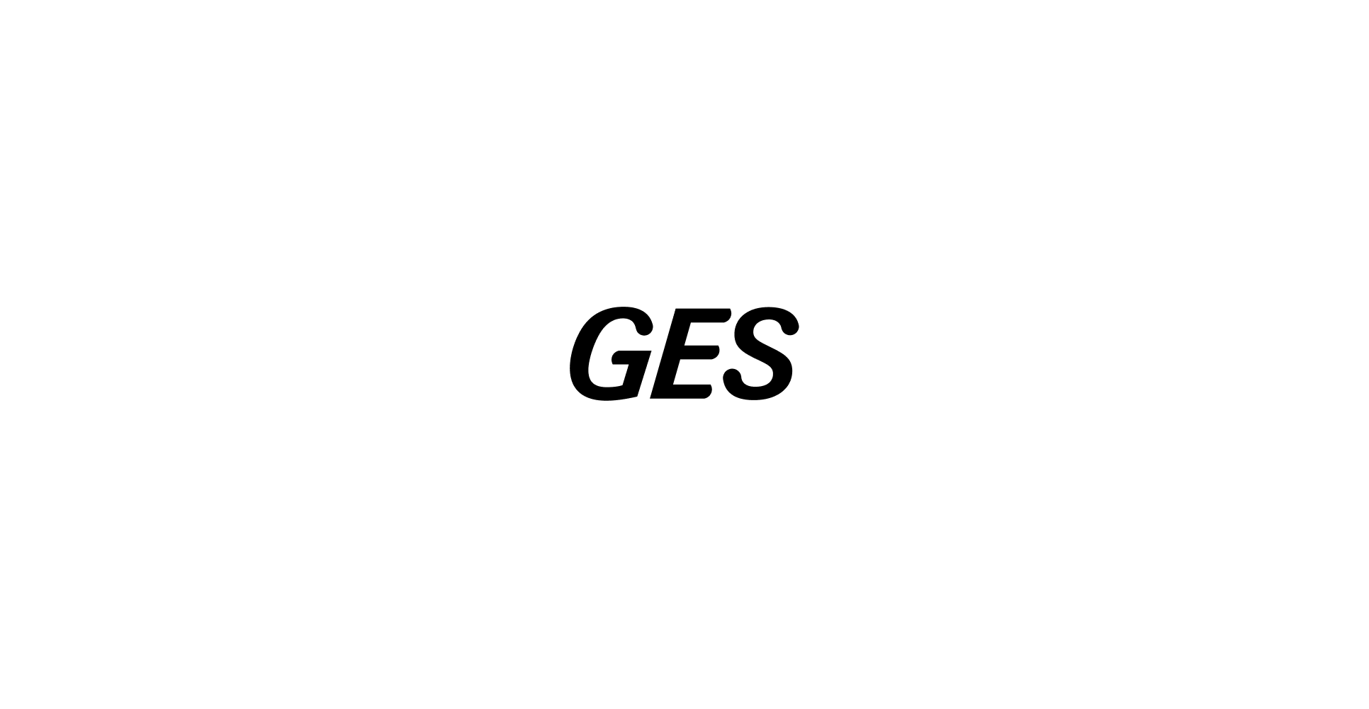
The GES name, set in our custom typography. It may be used without the logomark in simplified or technical situations, particularly in print where the spirograph’s detail or colour range may not reproduce clearly. In these cases, the wordmark ensures maximum visibility and clarity.
Clear space
The GES logo is iconic by design. Its form has stood the test of time — a constant in a changing world. The dynamic colour range reflects the diversity of our community, the breadth of our services, and the inclusivity at the heart of everything we do.
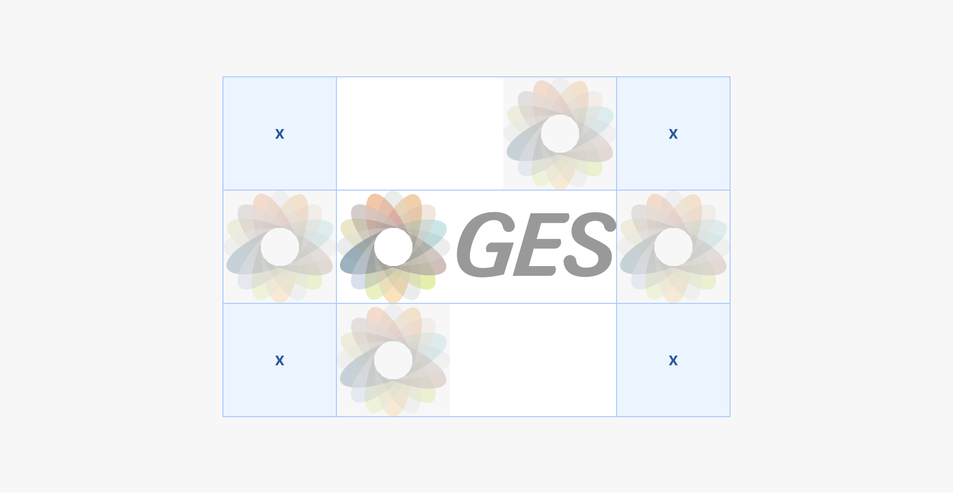
Default
Use the logomark as a guide to clearspace.
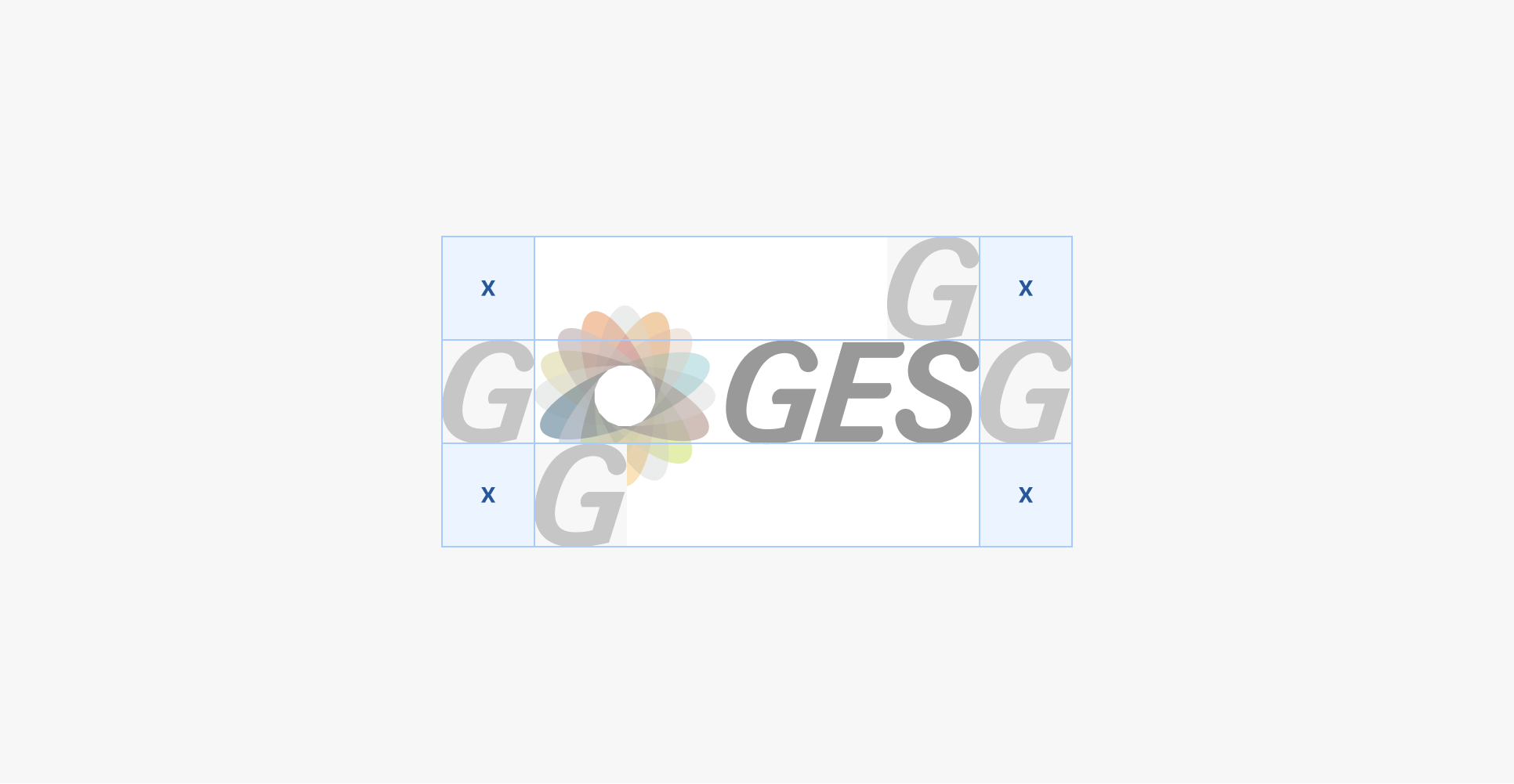
Tight
Use the height and width of the GES ‘G’ as a guide to clearspace for tighter formats.
Size
Give the logo enough space to stay clear and legible—around 5% of the layout’s shortest edge is a good guide, but use your judgment.
Remove the service mark at smaller sizes to keep things readable.
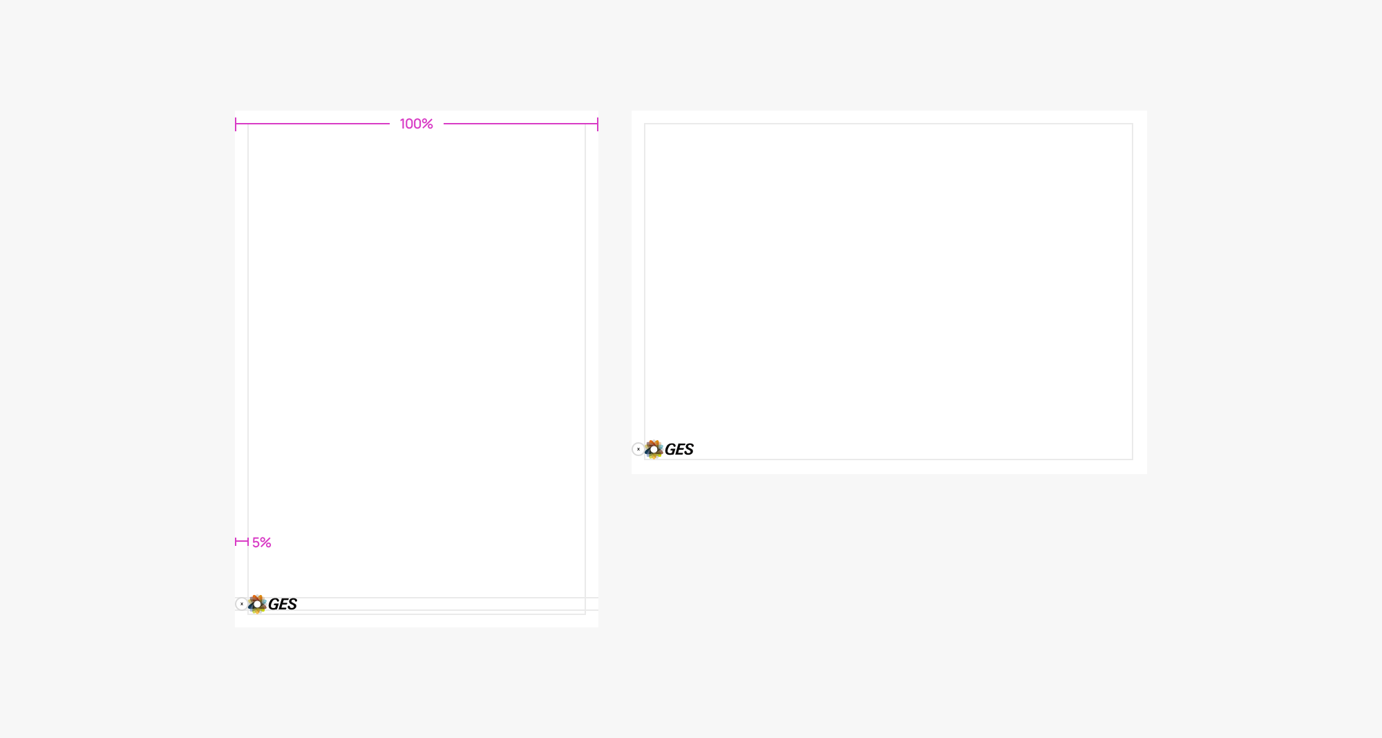
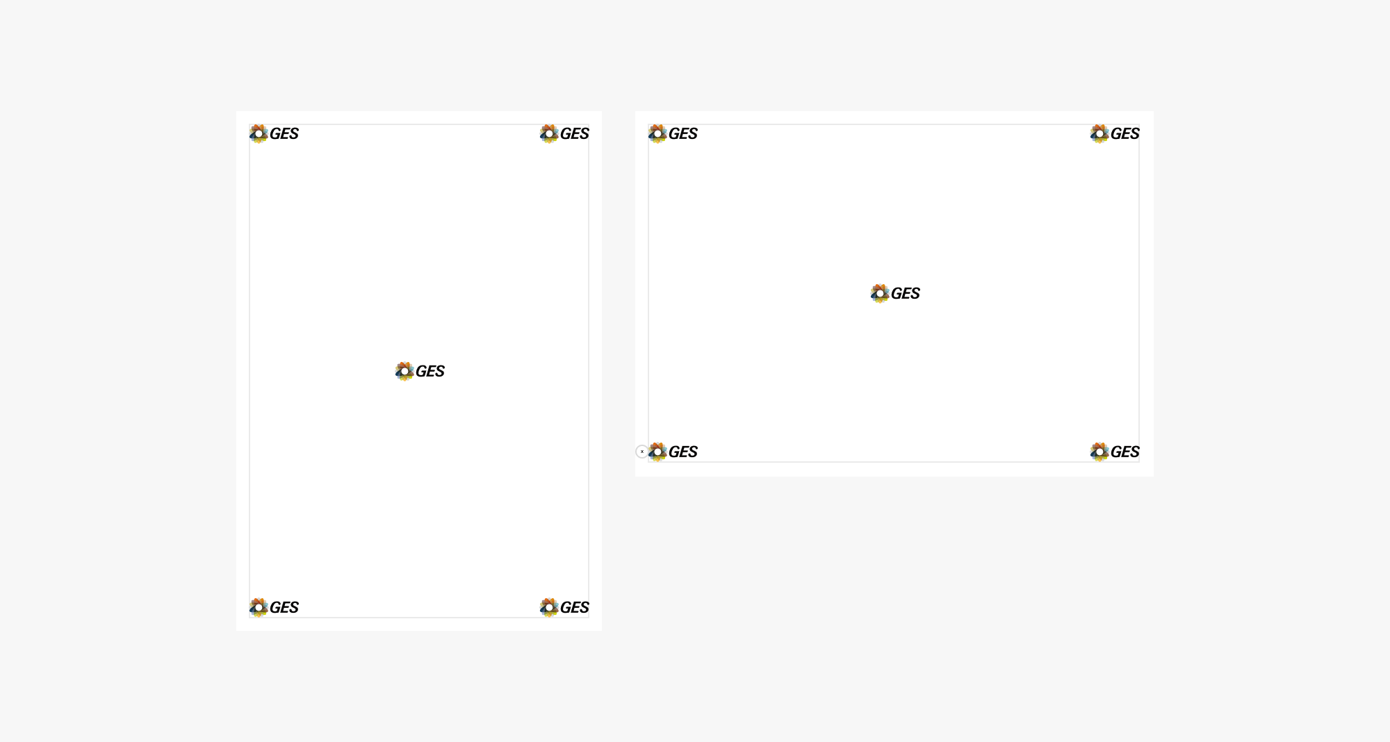
Placement
The logo can sit in any corner—choose the position that best suits the layout and purpose. In rare cases, centered placement is also acceptable if it feels appropriate.
Containers
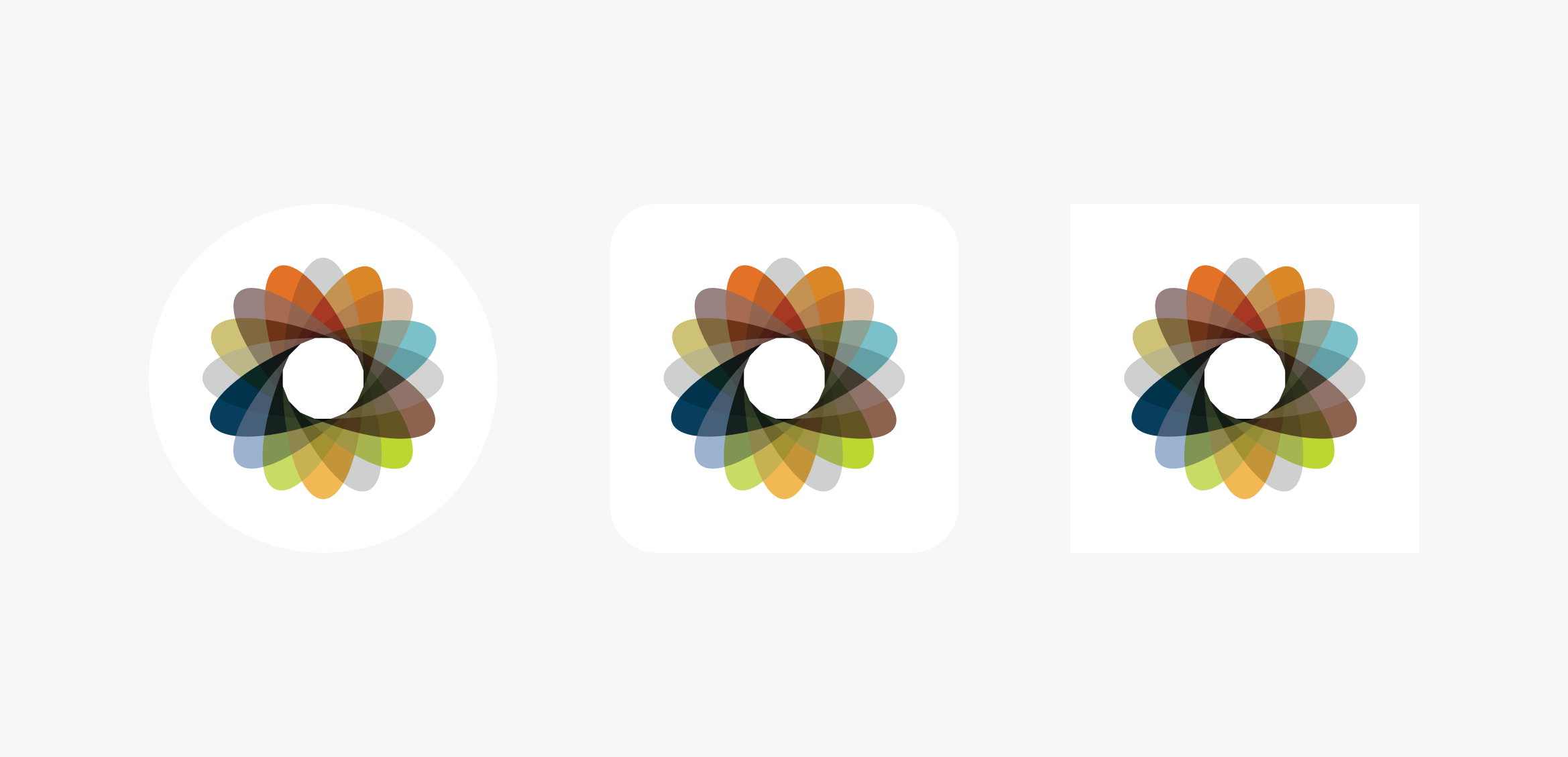
The full-colour spirograph is our most recognisable brand element. Use it on a light background whenever possible—white works best to let the colours stand out.
In tight spaces (like social media), use a container if needed and keep clear space around it. Stick to the full-colour version—it’s the most effective, even at small sizes.
Favicon
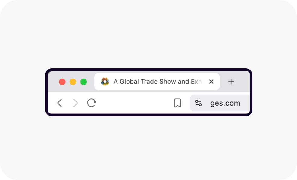
The favicon is intended for web use only and should not be applied to native app icons or other non-browser applications.
Avatar
There are two approaches to how GES is visually represented in avatar spaces and brand icons — depending on context and clarity.

Primary usage
Across most platforms and channels, we use the spirograph logomark to represent GES. It’s distinctive, recognisable, and the strongest expression of our visual identity — especially in small or circular formats.

Alternative usage
In rare cases where clarity of the company name is essential, such as sponsorships, co-branded placements, or restricted environments, the wordmark may be used instead. This ensures the GES name remains clearly visible when the spirograph alone may not be understood.
Brand partnerships
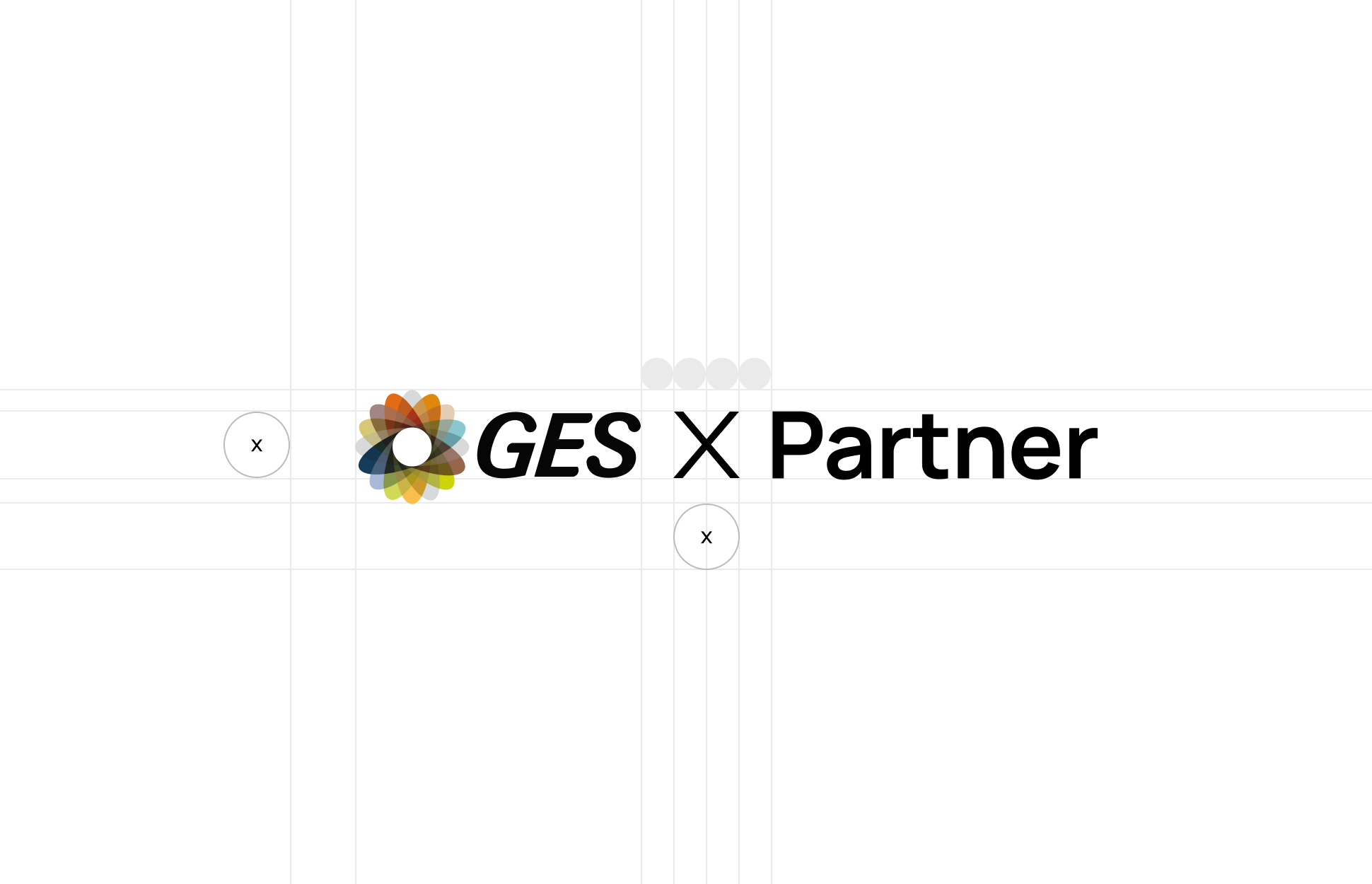
When co-branding, we display the GES logo alongside our partner’s, separated by an “X”. Allow enough space between each logo and the “X” to keep things balanced and uncluttered.
Start by sizing the GES logo, then adjust the partner logo optically to create a visually balanced and centred composition.
Service mark usage
The SM symbol indicates service mark status and should be included by default on the first or most prominent appearance of the GES logo. While its use is most relevant in the US, it can be used globally where appropriate.
You can omit the SM symbol if the logo is very small or the mark becomes unreadable, for example if it starts to appear as a dot or smudge. Prioritise clarity and visual balance: use the SM where it adds value, and remove it when it compromises legibility.
Logo below 180px tall - SM too small

Logo below 180px tall - SM removed
Previous
Overview
Next
Colour
© Gudstuff Design Ltd
All Rights Reserved
Our logo
Contents
Using our logo
Our logo specs
Using our logo
The GES logo is a key part of our identity, and how we use it matters. From the full lockup to the standalone spirograph, each version has a role to play depending on the context.
This section outlines when to use the core logo, when to lean on more flexible formats, and how to maintain clarity and consistency across every application, from event signage to social icons.

Core
The full-colour spirograph works best on light backgrounds—this keeps the colours vibrant and clear.
On darker backgrounds, the full-colour version can be harder to get right. In those cases, consider using the mono mark for better contrast and clarity.

Core on light

Core on dark
The mono white is our preferred logo variation on dark backgrounds due to its high contrast.
Black and white
Use the black logo on light backgrounds, and the white logo on dark or photographic ones, whichever gives you the best contrast and legibility.
When in doubt, test the combination or refer to the Colour Pairing Tool for guidance.

Mono black

Mono white

Tone on tone
If the background is a light colour, use the darkest shade of that colour for the logo. It helps maintain contrast while staying visually consistent.
See the Logo Showcase for examples.


Our logo specs
The GES logo is a key part of our identity. To keep it clear and consistent, always follow the basic specs: spacing, sizing, placement and colour usage.
This section gives you the practical guidance you need to apply the logo correctly across all formats, from print and signage to digital and motion. It's not about decoration, it's about maintaining clarity, impact and recognisability wherever our logo appears.


Identity
The GES logo is a familiar, recognisable mark. Its lasting form reflects our heritage, while the dynamic colour range speaks to the diversity of our work, our community, and the experiences we help create.

Primary

Secondary
Elements
Our logo is built from three core components. Each can be used flexibly depending on the space, context, or technical requirements — but together, they form the foundation of the GES brand.

Full logo lockup
The default and most recognisable expression of our brand, with the logomark on the left and wordmark on the right. This is the preferred version and should be used wherever space and format allow.
This is commonly known as the ‘logo’.

Logomark
The spirograph symbol, our most distinctive visual asset. It’s used on its own when space is tight or where a bold, visual presence is needed (like social icons or graphic treatments).

Wordmark
The GES name, set in our custom typography. It may be used without the logomark in simplified or technical situations, particularly in print where the spirograph’s detail or colour range may not reproduce clearly. In these cases, the wordmark ensures maximum visibility and clarity.
Clear space
The GES logo is iconic by design. Its form has stood the test of time — a constant in a changing world. The dynamic colour range reflects the diversity of our community, the breadth of our services, and the inclusivity at the heart of everything we do.

Default
Use the logomark as a guide to clearspace.

Tight
Use the height and width of the GES ‘G’ as a guide to clearspace for tighter formats.
Size
Give the logo enough space to stay clear and legible—around 5% of the layout’s shortest edge is a good guide, but use your judgment.
Remove the service mark at smaller sizes to keep things readable.

Placement
The logo can sit in any corner—choose the position that best suits the layout and purpose. In rare cases, centered placement is also acceptable if it feels appropriate.

Containers
The full-colour spirograph is our most recognisable brand element. Use it on a light background whenever possible—white works best to let the colours stand out.
In tight spaces (like social media), use a container if needed and keep clear space around it. Stick to the full-colour version—it’s the most effective, even at small sizes.

Favicon
The favicon is intended for web use only and should not be applied to native app icons or other non-browser applications.


Avatar
There are two approaches to how GES is visually represented in avatar spaces and brand icons — depending on context and clarity.

Primary usage
Across most platforms and channels, we use the spirograph logomark to represent GES. It’s distinctive, recognisable, and the strongest expression of our visual identity — especially in small or circular formats.

Alternative usage
In rare cases where clarity of the company name is essential, such as sponsorships, co-branded placements, or restricted environments, the wordmark may be used instead. This ensures the GES name remains clearly visible when the spirograph alone may not be understood.
Brand partnerships
When co-branding, we display the GES logo alongside our partner’s, separated by an “X”. Allow enough space between each logo and the “X” to keep things balanced and uncluttered.
Start by sizing the GES logo, then adjust the partner logo optically to create a visually balanced and centred composition.

Service mark usage
The SM symbol indicates service mark status and should be included by default on the first or most prominent appearance of the GES logo. While its use is most relevant in the US, it can be used globally where appropriate.
You can omit the SM symbol if the logo is very small or the mark becomes unreadable, for example if it starts to appear as a dot or smudge. Prioritise clarity and visual balance: use the SM where it adds value, and remove it when it compromises legibility.

Logo below 180px tall - SM too small

Logo below 180px tall - SM removed
Previous
Overview
Next
Colour
© Gudstuff Design Ltd
All Rights Reserved
Our logo
Contents
Using our logo
Our logo specs
Using our logo
The GES logo is a key part of our identity, and how we use it matters. From the full lockup to the standalone spirograph, each version has a role to play depending on the context.
This section outlines when to use the core logo, when to lean on more flexible formats, and how to maintain clarity and consistency across every application, from event signage to social icons.

Core
The full-colour spirograph works best on light backgrounds, as this keeps the colours vibrant and clear.
On darker backgrounds, the full-colour version can be harder to get right. In those cases, consider using the mono mark for better contrast and clarity.

Core on light

Core on dark
The mono white is our preferred logo variation on dark backgrounds due to its high contrast.
Black and white
Use the black logo on light backgrounds, and the white logo on dark or photographic ones, whichever gives you the best contrast and legibility.
When in doubt, test the combination or refer to the Colour Pairing Tool for guidance.

Mono black

Mono white

Tone on tone
If the background is a light colour, use the darkest shade of that colour for the logo. It helps maintain contrast while staying visually consistent.
See the Logo Showcase for examples.


Our logo specs
The GES logo is a key part of our identity. To keep it clear and consistent, always follow the basic specs: spacing, sizing, placement and colour usage.
This section gives you the practical guidance you need to apply the logo correctly across all formats, from print and signage to digital and motion. It's not about decoration, it's about maintaining clarity, impact and recognisability wherever our logo appears.


Identity
The GES logo is a familiar, recognisable mark. Its lasting form reflects our heritage, while the dynamic colour range speaks to the diversity of our work, our community, and the experiences we help create.

Primary

Secondary
Elements
Our logo is built from three core components. Each can be used flexibly depending on the space, context, or technical requirements, but together, they form the foundation of the GES brand.

Full logo lockup
The default and most recognisable expression of our brand, with the logomark on the left and wordmark on the right. This is the preferred version and should be used wherever space and format allow.
This is commonly known as the ‘logo’.

Logomark
The spirograph symbol, our most distinctive visual asset. It’s used on its own when space is tight or where a bold, visual presence is needed (like social icons or graphic treatments).

Wordmark
The GES name, set in our custom typography. It may be used without the logomark in simplified or technical situations, particularly in print where the spirograph’s detail or colour range may not reproduce clearly. In these cases, the wordmark ensures maximum visibility and clarity.
Clear space
To keep the logo clear and legible, we use two levels of spacing: default, which uses the spirograph as padding on all sides, and tight, which allows for a more compact layout. Tight spacing is preferred in most designs but should only be used when a designer can ensure balance and clarity. When in doubt, default spacing is the safe choice.

Default
Use the logomark as a guide to clearspace.

Tight
Use the height and width of the GES ‘G’ as a guide to clearspace for tighter formats.
Size
Give the logo enough space to stay clear and legible. Around 5% of the layout’s shortest edge is a good guide, but use your judgment.
Remove the service mark at smaller sizes to keep things readable.

Placement
The logo can sit in any corner. Choose the position that best suits the layout and purpose. In rare cases, centered placement is also acceptable if it feels appropriate.

Containers
The full-colour spirograph is our most recognisable brand element. Use it on a light background whenever possible. White works best to let the colours stand out.
In tight spaces (like social media), use a container if needed and keep clear space around it. Stick to the full-colour version, as it’s the most effective even at small sizes.

Favicon
The favicon is intended for web use only and should not be applied to native app icons or other non-browser applications.


Avatar
There are two approaches to how GES is visually represented in avatar spaces and brand icons, depending on context and clarity.

Primary usage
Across most platforms and channels, we use the spirograph logomark to represent GES. It’s distinctive, recognisable, and the strongest expression of our visual identity, especially in small or circular formats.

Alternative usage
In rare cases where clarity of the company name is essential, such as sponsorships, co-branded placements, or restricted environments, the wordmark may be used instead. This ensures the GES name remains clearly visible when the spirograph alone may not be understood.
Brand partnerships
When co-branding, we display the GES logo alongside our partner’s, separated by an “X”. Allow enough space between each logo and the “X” to keep things balanced and uncluttered.
Start by sizing the GES logo, then adjust the partner logo optically to create a visually balanced and centred composition.

Service mark usage
The SM symbol indicates service mark status and should be included by default on the first or most prominent appearance of the GES logo. While its use is most relevant in the US, it can be used globally where appropriate.
You can omit the SM symbol if the logo is very small or the mark becomes unreadable, for example if it starts to appear as a dot or smudge. Prioritise clarity and visual balance: use the SM where it adds value, and remove it when it compromises legibility.


Logo below 180px tall - SM too small

Logo below 180px tall - SM removed
Previous
Overview
Next
Colour
© Gudstuff Design Ltd
All Rights Reserved